It's looking good so far, I really like the texture on the pagoda. Can't wait to see it finished!

-
Welcome to Smeargle's Studio! Please be sure to review the studio rules. Feel also free to check out our hub to learn more about this place!Welcome to Smogon! Take a moment to read the Introduction to Smogon for a run-down on everything Smogon, and make sure you take some time to read the global rules.Congrats to the winners of the 2023 Smog Awards!
Monthly Art Contest 4!
- Thread starter Bucky
- Start date
Yilx that is awesome. Took me a few seconds to find the shrine though.Wonderful. The blurring effect looks great; almost like a powerful hurricane in which the pagoda is in the eye of the storm. Quality is top-notch, and matches all of the contest's specifications.Yilx, that piece of work is very raw and intense. Just what two dragons fighting should feel like. I love it.HOLY FUCK PISS YILX
why are there so many good artists on smogon that dont make me want to enter
EDIT: i learned 2 things today, micron pens draw better than dip pens on paper bags, and micron pens like to piss all over my hands
EDIT 2: my MAC 4 entry is done, and i will scan when it is dry (~20 mins)
(my entry is a seascape with kingdra,seadra,horsea,dratini,and dragonair featured)
EDIT 3:
scanning took out a lot of the quality :(WIP stage 2...
I'm only posting for comments before I continue..
The stalagmites will all look like the closest one, and will have another detail layer over them for the individual rocks that make them up..
Dratini/den will be moved around
Water will be darkened(top) and lightened (maybe, bottom)
Den will be finished (deck, may be darkened.)
Any thoughts?
Edit:
I didn't mention that I will be adding a sort of texture to everything to match the den.
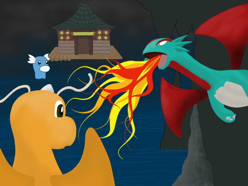
Everything will eventually have that sort of feel :)@DjGopher: I really like it so far; adding the texture like you said will be a great improvement. One suggestion I have is maybe showing the light from Salamence's fire shine off of Dragonite. That would not only make a cool effect, but also fit the competition's plus points better. :)
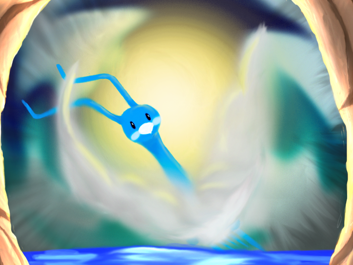
@Plus: Wow! Those are some amazing effects going on there! It's very vibrant; I like how the colors stand out so well. I also like how Alteria's cloud body looks so light and ethereal. Fits the competition very well; great job.@bombiron, I'm totally in love with it. Props to you for giving us something that isn't run-of-the-mill (not that the other artists' work is by any means). I love the paper bag as your canvass. Would this be at the bottom of the Dragon's Den? Don't mind me, just postin' my entry...

I think I'll go now.
EDIT: Made the beam more solid...I guess? Final Entry anyway.@Fatecrashers: Your composition is excellent! The lighting and shading are perfect as well, and the texture on the rocks is a nice touch. I just can't figure out what that green beam is supposed to be though O.O
@Plus: The lighting is EXCELLENT! I absolutely love the cave walls on the sides and the way the light is reflected off of the rocks. The position of the Altaria could be a little bit better, but it's still great and the colors are sooooo preeeetttyyy!!!!
@DjGopher: Finally! A Salemence!!!! I love the way you positioned that Salamence, but the Dratini definitely needs to be moved around like you said. The water is soooo niiiicccceeee!!!! It's a great picture overall and I'm really looking forward to seeing the final result. Don't forget to work your lighting, especially with Salamence's bright fiery dragon breath ^__^
@bombiron: Flawless use of texture, my friend. It's absolutely fantastic. I know exactly what you mean about your scanner butchering the quality, but it still looks excellent. I think it's incredible how you were able to incorporate lighting even though you were only using black. You're a fantastic artist d00d.
Uhhh yeah...the green beam is my sneaky way of incorporating the pagoda from Dragon's Den. It's one of the support posts you see. In my original sketch I wanted to use a rock to anchor the composition but I ultimately thought that the green beam fit in with the colour scheme better and looked nicer. Guess that sure backfired huh :PMaybe if you made it brown and put a line down the middle to look like a 3 dimensional block and then gave it a wood texture lol. There's actually an easy way to do a wood grain in photoshop if you go to Filter then Render then Fibers and play around with the settings until it looks wood-like. You can change the perspective of it afterwards by going to Edit then Free Transform. But it's up to you if you wanna change it, I like the picture regardless ^___^ I'm loving the submission by Plus! The impression of just looking through into the Dragon's Den from the cave, and seeing Altaria immersed in a bath of light rays through the clouds that make up its body and wings... wow. It's an entire story captured with a single picture. I love it.
I also really like the artwork by Yilx, but the connection to the Dragon's Den seems to be kinda "tossed in at the last minute". But such an amazing scene with all the action and energy -- how can I not love it? Good job!
The composition by Fatecrashers is top-notch. I really enjoy the bold use of color and perspective.@Fatecrashers: Look at those magikarp; they're so cute! I really like how you decided to do an underwater setting, while still creatively incorporating the themes of the contest. I also like how the beam stands out against the pokemon, giving it that "Technology meets nature" feel to the picture. The textures on the rocks and water looks great; maybe you should try texturing the pokemon as well? I'm wondering what it would look like.
Thanks :D@DjGopher: Finally! A Salemence!!!! I love the way you positioned that Salamence, but the Dratini definitely needs to be moved around like you said. The water is soooo niiiicccceeee!!!! It's a great picture overall and I'm really looking forward to seeing the final result. Don't forget to work your lighting, especially with Salamence's bright fiery dragon breath ^__^
Salamence is being made on a different canvas than everything else..
So when I condense it for a png it looks odd.The water isn't done..
But thanks for the tips/comments :D
it has washes that the scanner cut out@bombiron: Flawless use of texture, my friend. It's absolutely fantastic. I know exactly what you mean about your scanner butchering the quality, but it still looks excellent. I think it's incredible how you were able to incorporate lighting even though you were only using black. You're a fantastic artist d00d.@Yilx: That's kind of funny, because what you described you were going for is more or less how I felt.Yilx, your art is excellent! I love the motion conveyed in the piece and the whole composition is amazing!
@ Fatecrashers, I love the colors and the whole style of your picture! It just has so much personality. I especially like the plastic wrap texture of the water. It reminds me of a pokemon card which, in my book, is a good thing. My only suggestion is that you move the dragonite's half with the head on it down just a tad, its body just seems to disconnect behind the pylon. Great Job!Users Who Are Viewing This Thread (Users: 1, Guests: 0)
- ... and 1 more.