Approved make dark mode look good

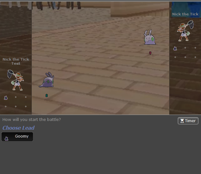
So I recently saw what Showdown dark mode looks like, and I noticed that most of the battle UI continues to use light mode colors and it just doesn't look good.

Screenshot 2022-01-11 051345.png
Screenshot 2022-01-11 051457.png


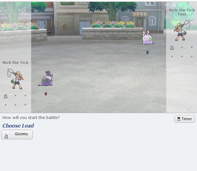
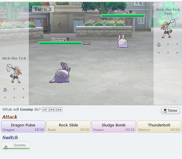
In light mode, everything is colored to go well with the pale blue used in the chat box and move selection area. But in dark mode...

Screenshot 2022-01-11 051412.png
Screenshot 2022-01-11 051525.png


...those pastel colors clash hard with the dark grey.

Screenshot 2022-01-11 051412.png
Screenshot 2022-01-11 051525.png


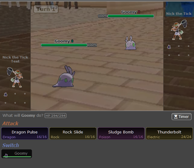
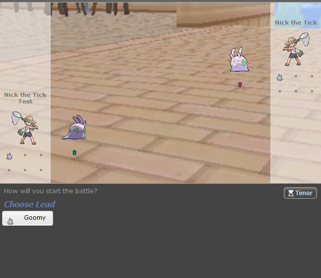
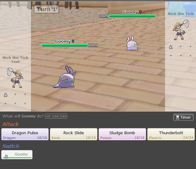
These are some quick mock-ups I threw together by just inverting the light areas and then giving them a 180 hue shift to return them to their original hue (and also slightly darkening the main battle area), and aside from the trainer and Pokemon sprites (which probably shouldn't be altered by dark mode but I couldn't be bothered to key them out) it already looks more cohesive than current dark mode.
 
Last edited by a moderator:

Celever

i am town
is a Community Contributor
I’d be happy with a darkest mode that’s like this, but I also honestly prefer the current dark mode. I’ve used it for years because showdown light mode makes me fatigued (ADHD light sensitivity roll up), but I still want vibrant colours on screen and not everything to be black. Current dark mode is more accessibility- than aesthetic-oriented, and does that job well.

IIRC there are google extensions with different palettes for showdown. You might have to dig for them though.
 

AM

is a Community Leader Alumnusis a Community Contributor Alumnusis a Tiering Contributor Alumnusis a Contributor Alumnusis a Battle Simulator Moderator Alumnusis a Past WCoP Champion
LCPL Champion
I would much rather not prefer a darker palette on moves over the already dark background. The colors are representative of types anyways. I guess if people wanted this as an alternative option sure but personally don't see an issue. Dealing with some color blindness as well, the dark over tones would make it harder on the eyes unless a much more easy on the eyes option was provided.
 
When battling in PS! Dark mode, the backgrounds for the Switch buttons and the Terastallize button stick out, because they keep the original background meant for Light Mode, and in my opinion, it makes the battle UI as a whole look out-of-place. This is just a personal opinion, but either a set option to change it or an overhaul of PS! dark mode is long overdue, since a decent amount of users use Dark Mode as their default.

Edit by Felucia: I merged this suggestion into a different thread, since they're strongly related, and I plan to tackle them both at once
 
Last edited by a moderator:
I will second that the current colors look bad and strain my eyes.
I much prefer the colors that come with dark reader, which I believe is an inverted brightness of the original colors. It also slightly darkens the background I think.

Here's how dark mode looks vs how Dark Reader does it, I can highly recommend the Dark Reader plugin for anyone that prefers the latter.
Would love to hear AM's opinion on the bottom screenshot:

1704750344694.png
1704750222193.png
 

Felucia

Robot Empress
is a Forum Moderatoris a Battle Simulator Moderator
I recently co-authored a dark mode update with Zarel that changed a lot of elements in PS' usage as a chatter, such as the headers of PM windows that were still light in dark mode. I think that one was a huge upgrade to the general experience, but I (we) forgot to consider battles. I don't know if I have the authority to mark this as approved so I'm pinging Mia, but if nobody else tackles this in the next month or so I'll look into it.


Edit: I have Zarel's approval to work on this, so I will get started on that very soon. I also merged the following approved suggestion into this one:
When battling in PS! Dark mode, the backgrounds for the Switch buttons and the Terastallize button stick out, because they keep the original background meant for Light Mode, and in my opinion, it makes the battle UI as a whole look out-of-place. This is just a personal opinion, but either a set option to change it or an overhaul of PS! dark mode is long overdue, since a decent amount of users use Dark Mode as their default.
 
Last edited:

Users Who Are Viewing This Thread (Users: 1, Guests: 0)

Top