

Hello all,
You may have noticed that many new icon sprites were implemented into showdown, encompassing every gen 9 mon up to Walking Wake and Iron Leaves! This was done to keep parity with the previous generations of icons, as well as looking (in my opinion) a lot more stylish than the BDSP/SV style icons.
The full sheet of icons for gen 9 can be found here.
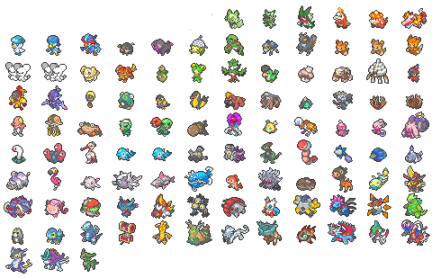
We've seen a lot of love shown to these icons, but with that came a fair amount of criticism as well. This is the internet, so clearly not all criticism we've received is necessarily thought-out or constructive. The purpose of this thread is to allow a space for players to express any dissatisfaction with an particular sprite. We would like the community to help us gauge which icons may need revisiting and more quality control. We will update changes made to icons in this thread when replying to critique that we have considered.
PLEASE NOTE: We won't be tolerating criticism that is overtly hateful and unhelpful. Be considerate when voicing your concerns with a given sprite, and try your best to articulate what exactly you feel is wrong with the icon. You don't need to offer any solutions to problems you propose, but please make an effort to make sure you are communicating what you need to.
Thank you all, we'll do our best to listen to community feedback.
- uppababy
You may have noticed that many new icon sprites were implemented into showdown, encompassing every gen 9 mon up to Walking Wake and Iron Leaves! This was done to keep parity with the previous generations of icons, as well as looking (in my opinion) a lot more stylish than the BDSP/SV style icons.
The full sheet of icons for gen 9 can be found here.
We've seen a lot of love shown to these icons, but with that came a fair amount of criticism as well. This is the internet, so clearly not all criticism we've received is necessarily thought-out or constructive. The purpose of this thread is to allow a space for players to express any dissatisfaction with an particular sprite. We would like the community to help us gauge which icons may need revisiting and more quality control. We will update changes made to icons in this thread when replying to critique that we have considered.
PLEASE NOTE: We won't be tolerating criticism that is overtly hateful and unhelpful. Be considerate when voicing your concerns with a given sprite, and try your best to articulate what exactly you feel is wrong with the icon. You don't need to offer any solutions to problems you propose, but please make an effort to make sure you are communicating what you need to.
Thank you all, we'll do our best to listen to community feedback.
- uppababy


 Enam's head seems a little off, almost like it's a mask of some sort. I think it has something to do with the lips being proportionally larger than they are on the actual model / other artwork, and with the white parts of the love heart starting on the side of the head, making it look more like her whole head is love-heart shaped.
 The top part of this sprite seems like it's the exact same as regular Palkia (minus the fin on the head being slightly longer), which results in the sprite looking really front-heavy and the back legs (or the one that's visible) looking tiny in comparison).
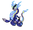
 The white-ish spaces that I presume were meant to separate the beads makes its eyes look like a TM in my eyes, or otherwise them just masking the rest of the body and making it look more shark-like than fish-like.
 ***
***
 *
* **
** *
*
 ***
*** *
* **
** *
* *
* ***
*** *
* ***
*** *
* **
**
 **
** **
** *
* *
* *
* ***
***
 ).
). - Both these sprites are a bit tiny; the glimmora artwork is fine but clodsire
 - The way it's hunched over makes it hard to make out the details of the mon, the pose itself also seems a bit too masculine. A more elegant pose like in the Arboliva sprite might fit it better.
 - Hard to see the body when so much of the sprite is its head.


