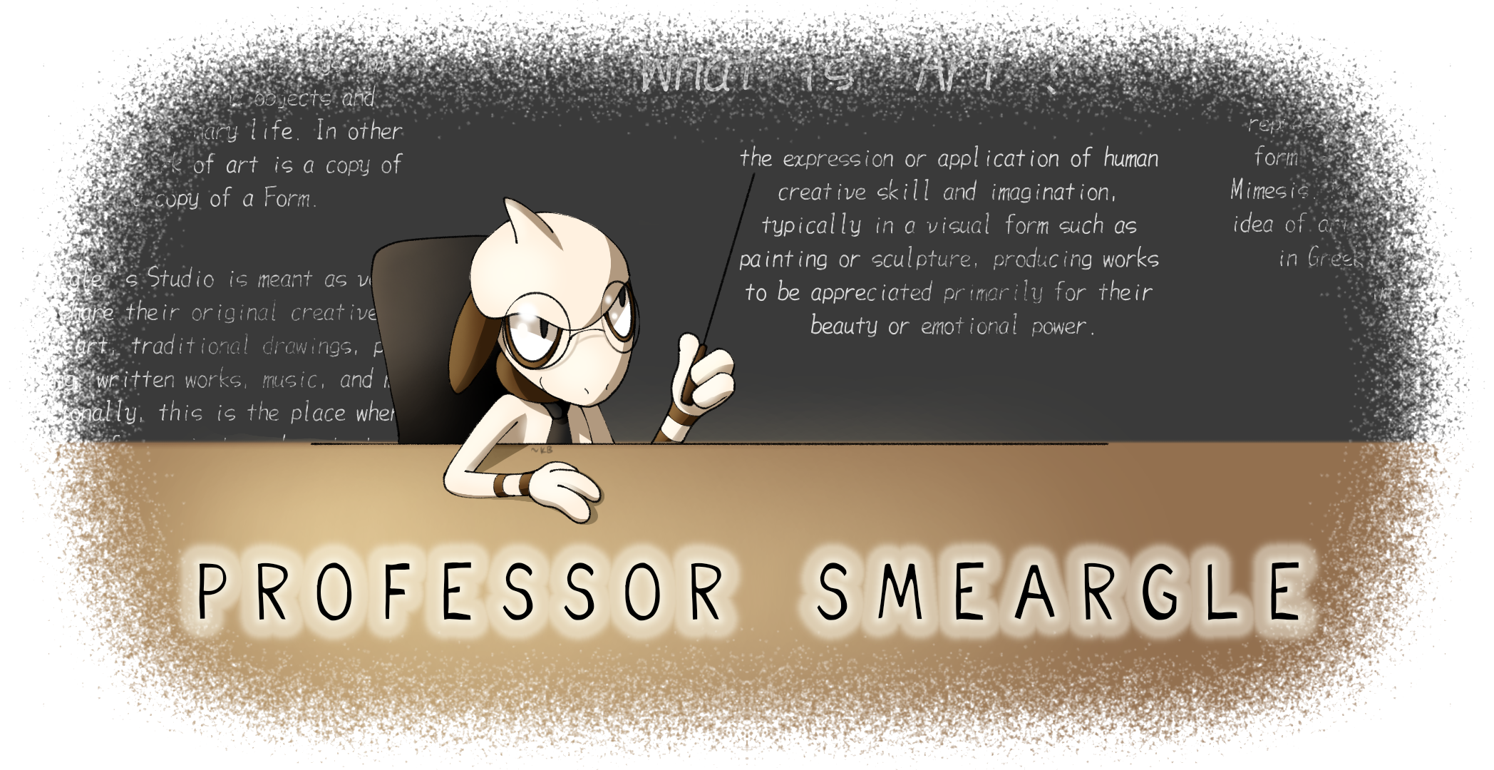
Professor Smeargle V2

Kaiju Bunny

♥・゚: * ̄(♡ㅅ♡❀) ̄
is a Site Content Manageris a Top Artistis a Community Leaderis a Community Contributoris a Smogon Media Contributoris a Battle Simulator Moderator Alumnus
Art Leader
OP here

Untitled62_20230509204225.png

Welcome!

Have you ever wondered how some of your favorite artists on the site create some of the wonderful pieces that they do? Looking for some tips and tricks on how to improve your own artistic process? Want to get into art, but you're not entirely sure on where to start? Look no further!

This thread will act as a community gateway on how you can get started on improving and sharing your skills with other artists in the community! In addition, we'll offer plenty of resources for you to peruse at your leisure that might not be specifically touched on in the thread itself. This includes updating this op every time we notice an especially handy tutorial or tip that could help any artist out!


Smeargle's Studio Forum Resources
RMA #2: Rate My Art!
Smeargle's Studio Discord Server
Arts & Culture Room on Pokémon Showdown!


3D Modeling Resources
Blender Instructional Video Collection (by Blender Guru)


Animation Resources
Animation / Art Resource Collection (by PuccaNoodles)
Animation / Illustration YouTube Channel (by Ethan Becker)


Art Protection Resources
Glaze Project (by University of Chicago)


Character Design Resources
Visual Library (by Character Design References)


Color Tips Resources
Color Picking Tips (by unknown)


Figure Drawing Resources
Stock Model Photography Collection (by JookpubStock)
Pose Search (by x6udpngx)


Hand Resources
Draw Better Hands Now (by Marco Bucci)
Hands 101 (by Joshua Taback)


Perspective Resources
How to find the true center of a rectangle in perspective (by @skulptduggery)
Reference Angle (by Art Technologist)
Animal Photo Art Reference Search (by x6udpngx)


Pokémon Design References
Pokémon Model Sheets


────────────────────────


If you'd like to share some of your own tips, tricks, and tutorials, you are heavily encouraged to do so here in this thread! We're excited to see your skills continuously improve and grow! Happy arting~!​
 

Kiwi

free فلسطين
is a Top Social Media Contributoris a Top Artistis a Forum Moderatoris a Community Contributor
Moderator
1683983066913.png

Do you ever sit down, draw a piece and then contemplate the entire point of those hours just because, “This isn’t even my style.” Don’t worry, that’s pretty much all of us, except the first person with a pen and paper.
To be able to absorb all of this information as best as you possibly can, you need to be at least decent at colour, form, line, shape, space, texture and value.
Before you can even start finding your style, you need to find what you like. An artist who has a style that you would love to draw in. You can use Pinterest or a Twitter scroll-through to find them, but it might be as simple as a popular manga artist. For me, that’s Gege Akutami’s Jujutsu Kaisen and Tatsuki Fujimoto’s Chainsaw Man.

Copying and Tracing:
How do I draw inspiration from their style? That’s the fun part, you don’t. Unless you’ve already been drawing for a long time, you’ve probably not developed a set-in-stone sense of the fundamentals, so learning these fundamentals at an early stage of art should be done by the dreaded copying and tracing techniques. “Oh no… copying and tracing is plagiarising!”, arguably, it’s not plagiarising unless you pass it off as your own original work. Why should you copy and trace though? It teaches you, or gives you an idea of their techniques. I recommend you:
  1. Get a sketchbook, and don’t be fancy with it. It’s for learning, not for showing off
  2. Copy everything you like. It doesn’t just have to be 1 particular style, because that’ll just teach you how to replicate. Copy from a variety of styles to learn their techniques, but focus on the ones you like. Note that it takes time to develop the techniques, but they’ll come eventually. Just keep buying sketchbooks and drawing
  3. Draw digitally, it’s much easier to chuck in colours in digital.
  4. Look back, if you aren’t seeing a difference in your ability, then you’re probably not even learning
1683983077452.png

The reason I recommend a sketchbook is that it forces you to composite your works and guess where things go. There’s also no undo, especially if you draw in pen. Some of these images below were drawn in pen to force myself not to erase anything. Here’s a few of my copying sketches:
1683983089257.png

1683983104257.png

(These were initially drawn on paper and then traced in digital!)​

Making your own thing:
Woah, it’s time to make your own art! This stands as a test to see how well you’ve absorbed information of techniques. You can do this as often as you’d like, there’s no boundaries on it. I would recommend however, to do a piece solely to assess your style. One way you can do this is to take an image from real life, and characterise/stylise it.

If you like drawing cars, find a realistic image and draw it how you like to. If you like to draw Pokemon, find any Pokemon official art that you like and stylise it. If you like drawing humans, take a figure pose and stylise it. You can probably get the gist.

However, I especially recommend doing a DTIYS (Draw this in your own style). This forces you to apply your techniques on a piece you like, and see where your style has gone. Here’s some examples of my own, but you can also refer to to see the Studio’s very own DTIYS event (Woah it's all coming together)
1683983158315.png
1683983167640.png
1683983197579.png

1683983239016.png

(Some of my recent artworks and a DTIYS)

*I'd like to note that, as a good measure, you should be copying and tracing whatever styles you like,
not to completely steal from them but to learn their techniques. Over time, you'll find your style changing
as you develop more skills in art. You don't have to be consistent unless you're doing something that
requires consistency (e.g. comics). Let your style grow as you grow, you'll always find something you
want to improve on
1683983313694.png

(Professor Smeargle agrees ^)
Hopefully this helps! I'm excited to see what the rest of you can put together. Could be anything from a tutorial on figure drawing to layer masking. Have fun :toast:
 

Attachments

Why your sketch looks better than the lineart
portrait human_20230520093517.png
a lot of artists say that cleaning up the sketch makes its worse. this is because of a few things:

  • The sketch itself is sloppy and has lots of different lines, making it hard to find the one correct line when inking
  • The extra lines provide fluidity and energy to the pose, as well as hide the actual form so the form must be interpreted.
    • But there's also nothing wrong with giving your final art extra lines for energy too. Make sure your final refinement isn't sloppy, but you can have crosshatching and extra lines to show motion. Just dont have chickenscratch lines that coincidentally happen to work as energy. Draw your lines with intention.
  • With sketches, the brain will automatically interpret the best looking one out of all the lines. Sketches give the viewer alternative interpretations, while lineart doesn’t. This means that unless you are completely correct with the lineart, it will look worse than the sketch.
    • As mentioned before, your lines should be intentional. By not allowing alternative interpretation, you can create really intricate and great looking forms with lots of detail. Your linework needs to be done well though. Follow through with your strokes. Learn when to use thick and thin lines.

For lineart, learning to control the lineweight goes a LONG way.

Thicker lines
- close to the camera
- areas of shadow
- edges of a form

Thinner lines
- further away
- areas in light (if you imagine there's a highlight, you can even just not draw a line entirely at that area! It will look like a light shining through and obscuring the edge of the object)
- details within an object

Using these rules of thumb will create a lineart hierarchy that is both more readable/pleasing to look at, as well as more detailed as the lineart itself is adding information like light/shadow.

if you follow all of these rules and it STILL looks bad, the problem might not be the linework but actually another fundamental. For instance, if you have a chickenscratch sketch it might look fine, but when you refine it could look bad because, for instance, you could have bad anatomical fundamentals that the sketch is hiding. In this case, work on your anatomy, not your linework.
credits: paraphrased from this dude in an art server (FullHeartContainer#0777)
 

Pissog

ولكل سؤال كانت فلسطين هي الجواب
is a Top Artist
SmartSelect_20230521_085251_Clip Studio.jpg

Hi! Today I wanted to share with you all my process for painting mons in watercolours.
DISCLAIMER: all of this is self taught and refined through trial and error so i'm not saying this is objectively right, there may still be some mistakes I haven't realised yet. This is just what I found to work best for me.
The software that I'm using is Clip Studio Paint and the brushes that I'm using are all basic and pre installed. This should also work in Procreate and Photoshop (as all brushes on CSP are exportable) but I can't guarantee it for other art softwares. Now, let's begin.
SmartSelect_20230521_090528_Clip Studio.jpg

The first step is sketching the mon you wanna paint and doing the lineart. I chose a Shuppet for this tutorial because it's hella cute and also because this method really shines on simpler pokemons without too many details, so if you have to paint an Eternatus don't use this method. I'm also not gonna go over the full process of sketching and lineart because it's not the goal of this tutorial, but I'm gonna give you a few tips:
- don't work with a completely white background, you only have one pair of eyes, don't tire them too much
- the eraser is your best friend
- never use pure 100% black. thank me later
SmartSelect_20230521_091505_Clip Studio.jpg

I used the basic g-pen to draw the sketch and the basic pencil to draw the lineart.
SmartSelect_20230521_092717_Clip Studio.jpg

The goal of this step is to assess where the light is coming from and which area is in the dark. Go to a new layer (below the lineart) and fill the shape of your mon with a neutral grey (it doesn't have to be precise). Now grab your eraser tool and erase the areas that are in the light. Then make a new layer and color the areas in the dark with a darker grey. Lastly, merge this two layers, set the opacity to 30% and hide it for the time being. We will use it later.
SmartSelect_20230521_093952_Clip Studio.jpg

We are almost to the fun part. Digital watercolours do not work well while floating on a blank canvas, they need a white background for them to work. So we will create a layer behind the lineart with 100% white and this time IT HAS TO BE PRECISE. In order not to miss anything, create a background layer filled with a vibrant color, like red for example. Then (on a different layer) close any open spot in the lineart with a pen

SmartSelect_20230521_093255_Clip Studio.jpg

and then use the bucket tool to fill your shape with white. Make sure your bucket tool has "refer multiple" checked. Then color with a pen the space near the lineart, as the bucket isn't perfect.
Screenshot_20230521_093214_Clip Studio.jpg
SmartSelect_20230521_093750_Clip Studio.jpg

Now, the important part of this step is to REPEAT IT FOR EVERY AREA THAT'S DIFFERENT FROM THE REST. Shuppet is a simple mon and one could argue that it only has one single connected area, but we have to distinguish between the area in the foreground (the head) and the area in the background (the body). With other, more complicated, mons it's absolutely essential to make a different white shape for every color and every part that's behind or in front of another.
Now hide the red layer and we're ready for the fun part.
SmartSelect_20230521_111431_Clip Studio.jpg

Finally the fun part: painting! In order to paint with watercolours, we must first (for every different white part) make a new layer and CLIP IT TO THE WHITE LAYER below it.

Screenshot_20230521_094227_Clip Studio.jpg

Watercolor is not gouache: if you add paint, that area will be darker, it doesn't matter how light the color you added is. So, the method to paint light is: not painting at all! Referencing the LightShadow layer you did in step II, paint with the color of your choice avoiding the light areas.
For the same reason you need to color with just one single brush stroke, without ever taking the pen off, otherwise you will have dark areas where the two strokes meet. Repeat one or two times to stabilize your color and we're done! For reference, I'm using the rough wash brush that should be included in the basic CSP brushes

Screenshot_20230521_094345_Clip Studio.jpg

Repeat this process for the body and we are ready to move on the next step.
SmartSelect_20230521_100508_Clip Studio.jpg


Now, my method to render shadows with watercolors is to use warm colors if the base color is cold, and cold colors if the base color is warm. In this case I went with red because I wanted my shuppet to be more purple overall, but other colors that work well in this case are orange and yellow. The main rule here is: have fun! Try every color you want, experiment and find your favourite. To apply them, simply create another layer over the base color ones, clip it and start painting. Of course, the thing of painting with a single stroke still apply.
SmartSelect_20230521_101138_Clip Studio.jpg

As I said earlier, this method doesn't work well with small details but every mon has some detailed part: the eyes! You can draw these with any method you like. My suggestion is to use the same brush you used for the lineart, but it's really up to you.
SmartSelect_20230521_101538_Clip Studio.jpg

This step is completely optional and I always always forget this BUT it does look good with some variety in the lineart. To do this, simply make a new layer above the lineart layer, clip it and use whatever color you like.
Illustration123.png

I hope you found this helpful or at least interesting and if you have any questions please ask. Have fun drawing! :D​
 
Last edited:

Kiwi

free فلسطين
is a Top Social Media Contributoris a Top Artistis a Forum Moderatoris a Community Contributor
Moderator
How to start STUDYING ART


I made this video about a year ago for some students of mine, but it's applicable to anyone starting out learning art so if you're a beginner definitely give it a watch.
I wish I listened to this when I was a beginner omg. I love your tip at 8:53, that's something I only found out about recently. Looks like it's useful for everyone!! Nice job Deka
 
Taught a class on brush work and edge control today, just thought I would share the main points here:

There are three main types of edges: Hard, Soft, and what I call "fractured"

1692595474832.png


When painting in shapes, each shape of VALUE or COLOR should have variation in its edges, they should not all be hard or soft.

1692595287633.png

Check out the following amazing piece of art by @YU2MARU on twitter, notice how each of the shapes used in Scizor have variation in their edges.

1692595618762.png

1692595869328.png

Some more tips:

We get lively BRUSH WORK by adjusting our brush marks as little as possible after putting them down.

If a brush mark isn't working, CTRL Z it away instead of messing with it too much.

A standard work flow can be: Put in shape -> Adjust edges with a brush/mixer tool.

We adjust our edges depending on the form we are defining.

Use the BIGGEST brush you can for the best effect.


Here are some examples that I did for the class:

1692596116883.png


1692596127487.png


If anyone is interested in art classes, I teach through my Patreon here: https://www.patreon.com/DekaDigitalPainting

Have a good one! If you have any questions about edges feel free to ask!


A quick video I made about the importance of keeping up our speed while doing art and how to do it.

The main points:

-Working fast helps us to learn faster

-It helps us to thumbnail, which in turn helps us to not waste time rendering a mediocre sketch


How can we do it?

-Prioritize your main big, medium, and small shapes. (composition)

-Make sure your perspective is correct from the start.

-If something about these two just isn't working and isnt being resolved relatively quickly, trash it instead of wasting time on it.
 
Last edited:

Users Who Are Viewing This Thread (Users: 1, Guests: 0)

Top