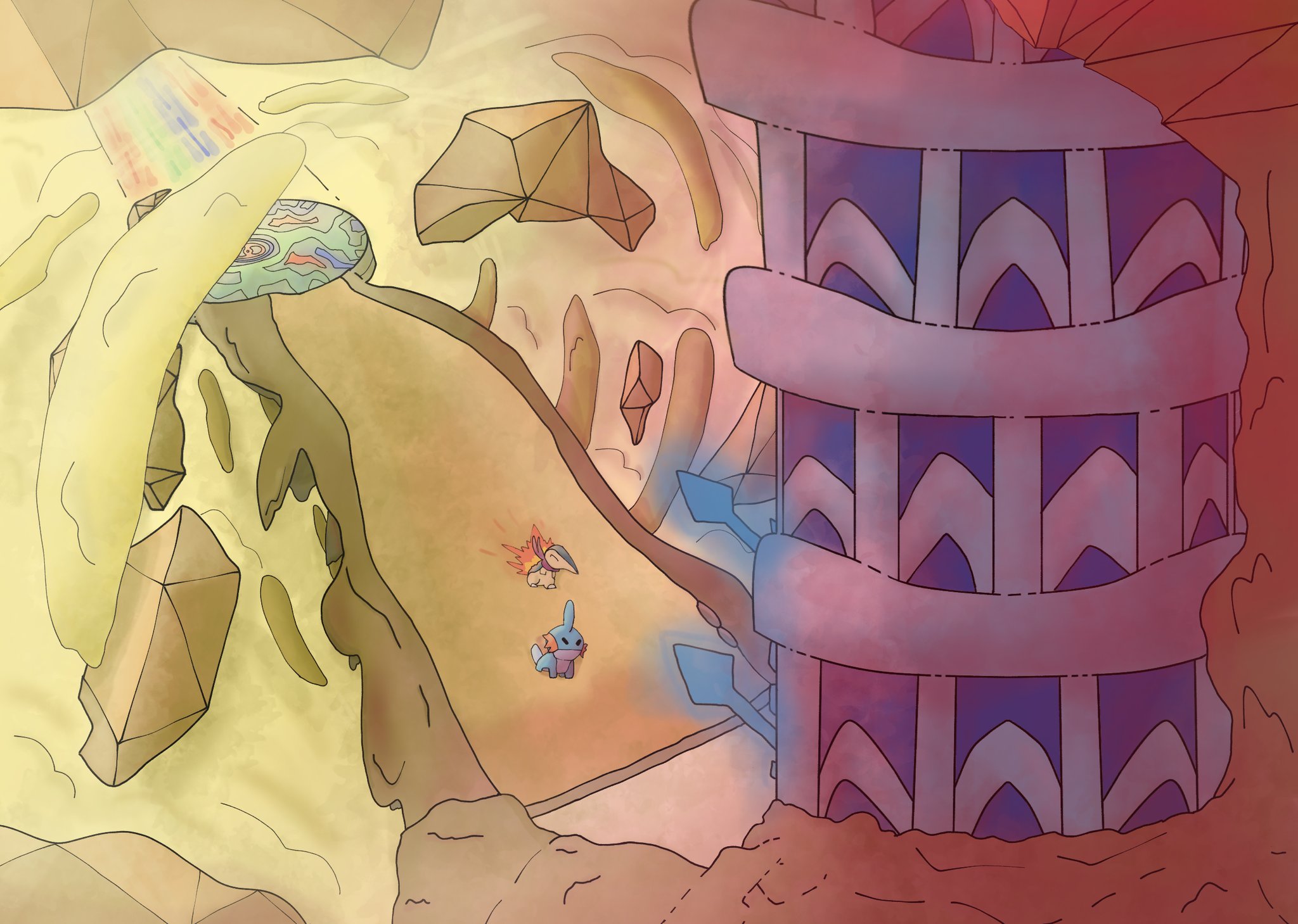
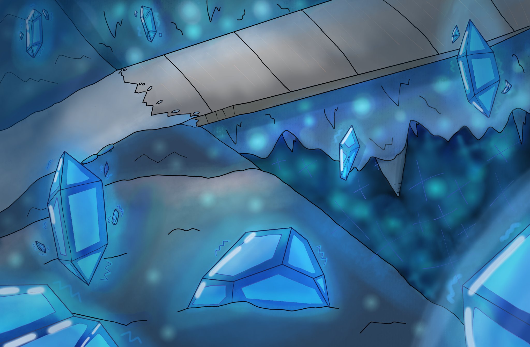
Arts & Culture Joint Event: Pokémon Background Challenge!

Violet

hilarity ensues
is a Battle Simulator Staff Alumnus
Smeargle’s Studio + Arts & Culture Joint Event: Pokémon Background Challenge!
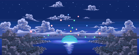


Description:

The Arts & Culture Room on PS! is collaborating with Smeargle’s Studio to bring you a brand-new competitive event! We all know that everyone here can draw Pokémon creatures, but how about Pokémon forests, cities, lakes, and caves? We’d like to give you the opportunity (and some incentive) to try reimagining the environments of the Pokémon world in your style.

Guidelines:

Pieces must have an emphasis on backgrounds. Characters are allowed in pieces, but take care not make works overly character-centric. For example, refrain from precisely rendering a figure just to slap some leaf and vine textures behind them. This event is intended to have people explore environments and locations they were drawn to in Pokémon. All types of styles and mediums are allowed and encouraged. We do ask that you provide us with a high-quality photo of your work if it happens to be a traditionally-made piece.

SIGN-UPS AND SUBMISSIONS SHOULD BE DONE VIA THIS GOOGLE FORM!

Submissions will open on March 14th, close on April 4th, and voting results will be tallied and released on April 11th.

Additionally:
  • Please no NSFW!
    • NSFW includes but is not limited to: Substance use, excessive blood, gore, nudity, and sexually explicit content.
  • Please no plagiarism!
    • If you are heavily referencing another artist’s work, you must provide a link to the original artwork and the artist’s handle. Uncredited use of another person’s art DOES count as plagiarism, and you will be promptly disqualified from competition if discovered.
Prizes:

Each piece will be voted on by a pre-selected panel of judges. Not all judges will be artists, but we believe this method is the best way to negate any outside manipulation of the vote. The three artists who score the highest will be eligible for the following prizes:
  • A custom avatar on PS!, a disabled username on PS!, a free namecolor change on PS, or a custom title on Smogon!
  • A $25 Amazon Gift Card
  • A one-month subscription for Discord Nitro
Each prize is exclusive; the first-placing artist receives the first pick of the pot, thereby eliminating whichever choice they selected. The second-placing artist will then have two remaining options to choose from, and so on. In the event of a prize recipient turning down their reward, the next highest-placing artist will be granted the opportunity to receive a prize.

Everyone else will receive, free of charge:
  • The boundless satisfaction of experimenting and breaking out of your comfort zone!

Other Notes:
  • Feel free to submit multiple pieces. All pieces will be evaluated, and any individual that submits more than one work will have their highest-scoring one automatically considered as their main competitive entry.
  • Don’t worry about being completely faithful to a location. Oftentimes, our exposure to some areas is incredibly limited, so we’re very much looking forward to seeing unique renditions for locations that never really got a chance to shine! This isn’t to say there is anything wrong with working with a common or popular choice; there is nigh infinite potential everywhere.
  • Have fun, or don’t. Not my problem.
Potentially helpful resources:

Artworks:
https://cdn.discordapp.com/attachme...tery-Dungeon-has-some-amazing-art-pokemon.gif

https://cdn.discordapp.com/attachme...199655424/254px-Fogbound_Lake_outside_TDS.png


https://m.bulbapedia.bulbagarden.net/wiki/Location_preview

Tips and Guides:
https://www.kotaku.com.au/2016/02/tips-for-drawing-backgrounds/


http://instagr.am/p/CPJK3BHFYeP/
 

Violet

hilarity ensues
is a Battle Simulator Staff Alumnus
Alright well, I just had a fun time looking through some early submissions!

First of all, thanks to the people who did submit legitimate entries! It's reassuring to see pieces this early in the submission timeframe.
On that note, wow uh, there were definitely a lot of non-entries. I'll use this post to clarify a few things that have come up:
- The location does have to be in Pokémon. Sorry to those 4 entries that submitted "NY" and nothing else.
- You don't have to use Discord or imgur to upload your work; those are suggested because they are common. If you want to use Twitter or imgbb or whatever, I really don't care as long as I can access the image in decent quality
- I've made the first 3 questions mandatory responses to stem the flow of empty submissions. The last one is still optional - it's just a space to clarify anything you might want to about your piece.
- Yes, you can work together with another user. All I ask for on this end is that you do so in good faith. I don't want one user piggybacking on the work of someone else just to claim the prize; work together if you're going to take this route. In case a pair does win the top prize, they will have to communicate between themselves who is able to receive it. We will not be distributing more than one (ex: Custom Avatar) prize to multiple users.
- You can also submit multiple pieces! We will give each piece equal opportunity to be ranked. Again, please do so in good faith. We don't want someone submitting 50 sketches that clearly took no time or effort. However, we would like to give those who enjoy making in-depth pieces for this event the opportunity to be rewarded for their hard work.
- Finally, to those guys who either submitted links straight from bulbapedia or the reference section in this post: I can read. Sorry! Any pieces that are ripped straight from somewhere else or blatantly plagiarized will be immediately deleted and no further entries from associated accounts will be accepted.
 

Violet

hilarity ensues
is a Battle Simulator Staff Alumnus
Reminder that there is only one week remaining for submissions!
Some people also asked about whether all the submitted art will be posted here, and to confirm, yes it will all be posted (unless someone specifically reaches out and asks for their work to stay private)
Good luck!
 

Violet

hilarity ensues
is a Battle Simulator Staff Alumnus
Votes have been tallied and winners have been revealed! Thank you to so much to everyone who participated, judged, or even watched! I had a lot of fun running the event and hopefully this will serve as a catalyst for more joint (non pokemon character lol) events in the future. If you missed it, you can find every submission below:


Maximus-Shempai - Cave of Origin


Keeping It Icy/Abyssal Ruins - Lilycove City


QuinnXD - Seafoam Islands


driftloomy - Ilex Forest


tumboni - Turffield Hill


Avielex - Frosty Forest Path (PMD)


icarusk - Bell Tower


Wet Kisser - Memorial Pillar (FRLG)


lost oblitus - Route 111 (RSE)


togedemaru133 - Power Plant


NurseTribble - Ballonlea


Gaboswampert - Temporal Tower & Chargestone Cave


Digital Skull - Bell Tower
[

TheStepStone - Sky Pillar


AmericanPi - Lumiose City


Venousbog - Lake Acuity


Leavannite - Radiant Chamber


sunsets - Dragonspiral Tower


Ivy - "The Place Clefairy Came From"


Albatross - Glitter Lighthouse

Edit: If you want critique feel free to ask in this thread, you can also now post your works in your respective threads as well!
 
Last edited:

Venousbog

In my dreams I'm dying all the time
is a Battle Simulator Moderator
I'd love a critique on my piece! There were definitely some holes in my knowledge of the software when making this, but I can't learn if I never know what to practice!
 

Violet

hilarity ensues
is a Battle Simulator Staff Alumnus
really love this one, the azelf only in the reflection is a great detail and very easy to miss, especially if you don't enlarge it
lmao I didnt notice that, thats super cool

I'd love a critique on my piece! There were definitely some holes in my knowledge of the software when making this, but I can't learn if I never know what to practice!
Yours was actually one of my personal favorites! There's a very clean shape language at play that makes for a composition that's easy on the eyes. That being said, the simplicity of the piece might hurt it when judging it from a perspective that prioritizes technical skill. There's a lot of negative space that I thought could have had some extra spice, particularly the sky. The faint lines in the sky seem like ambiguous additions that serve to take up a lot of that negative space, but I didn't find that they added anything special to the composition. Some flat-colored cloud formations accompanied by a flying silhouette of a pokemon is one possible idea that I had for it, but there are endless possibilities here. I also think that the volume of trees could have been multiplied exponentially to illustrate depth. More trees would better indicate the distance between the lake and the mountain range behind it while also creating a more natural landscape. While I very much do enjoy the tree shapes, the way in which they are all evenly spread out feels rather artificial. In the same vein, the way the mountains are aligned with no overlap whatsoever also comes across as fairly unnatural. When conceptualizing a landscape, it's important to look at reference images for a clear idea of how these places form. There's a lot that can't be seen because of other elements in the way; nature doesn't conform itself to meet our expectations or desires. Of course, artists can and should take artistic liberties to render environments in ways that they think will be more appealing to themselves or their intended audience, but it's important to have a stable balance. I hope this helped!
 

Daylight

angels roll their eyes
is an Artistis a Contributor to Smogon
really love this one, the azelf only in the reflection is a great detail and very easy to miss, especially if you don't enlarge it
Thanks! I’m glad to hear someone else enjoyed that detail. It was inspired by a piece by Winona Nelson depicting egrets flying over a lake where their reflection in the water depicts a different environment than the one they’re flying across.

It’s funny because, I actually had a really different composition in mind when I started sketching…

1BFD7BBB-AFD9-4D58-8101-75FD18CC1151.jpeg


As you can see, it was a lot more exaggerated and fantastical. But then I took a walk out to a nearby marsh and was really inspired by this views I saw that day…

1649834829544.jpeg
A1DEAA2D-35E3-4075-96E2-81F6C06B5550.jpeg


And my painting was quickly reborn as this…

FCAB3D4C-8F96-4834-9C95-B3DCFBDDE9A6.jpeg


It’s still whimsical but now there’s a lot more subtlety and serenity to it. I hope I managed to capture even a little the kind of quiet majesty of the mountain over the marsh that I really felt looking at those photos I took.

Also congrats to all the other winners! My personal favorite is capsav ’s Lumiose—which has a really cool composition, a gorgeous warm color palette, and really fresh funky clean linework! And also driftloomy ’s Ilex Forest, which is lovely and painterly to look at—and honestly looks straight out of the Pokémon anime with that color palette.
 

Venousbog

In my dreams I'm dying all the time
is a Battle Simulator Moderator
lmao I didnt notice that, thats super cool


Yours was actually one of my personal favorites! There's a very clean shape language at play that makes for a composition that's easy on the eyes. That being said, the simplicity of the piece might hurt it when judging it from a perspective that prioritizes technical skill. There's a lot of negative space that I thought could have had some extra spice, particularly the sky. The faint lines in the sky seem like ambiguous additions that serve to take up a lot of that negative space, but I didn't find that they added anything special to the composition. Some flat-colored cloud formations accompanied by a flying silhouette of a pokemon is one possible idea that I had for it, but there are endless possibilities here. I also think that the volume of trees could have been multiplied exponentially to illustrate depth. More trees would better indicate the distance between the lake and the mountain range behind it while also creating a more natural landscape. While I very much do enjoy the tree shapes, the way in which they are all evenly spread out feels rather artificial. In the same vein, the way the mountains are aligned with no overlap whatsoever also comes across as fairly unnatural. When conceptualizing a landscape, it's important to look at reference images for a clear idea of how these places form. There's a lot that can't be seen because of other elements in the way; nature doesn't conform itself to meet our expectations or desires. Of course, artists can and should take artistic liberties to render environments in ways that they think will be more appealing to themselves or their intended audience, but it's important to have a stable balance. I hope this helped!
Thanks so much, Vio. I definitely tried to do more with the mountains but felt it was out of my reach, I'll work on this negative space idea in my next piece, I never thought of it that way. Helps a lot!
 

fx

moon tourism
is an Artist Alumnusis a Forum Moderator Alumnus
Thanks! I’m glad to hear someone else enjoyed that detail. It was inspired by a piece by Winona Nelson depicting egrets flying over a lake where their reflection in the water depicts a different environment than the one they’re flying across.

It’s funny because, I actually had a really different composition in mind when I started sketching…

View attachment 418546

As you can see, it was a lot more exaggerated and fantastical. But then I took a walk out to a nearby marsh and was really inspired by this views I saw that day…

View attachment 418548View attachment 418550

And my painting was quickly reborn as this…

View attachment 418551

It’s still whimsical but now there’s a lot more subtlety and serenity to it. I hope I managed to capture even a little the kind of quiet majesty of the mountain over the marsh that I really felt looking at those photos I took.

Also congrats to all the other winners! My personal favorite is capsav ’s Lumiose—which has a really cool composition, a gorgeous warm color palette, and really fresh funky clean linework! And also driftloomy ’s Ilex Forest, which is lovely and painterly to look at—and honestly looks straight out of the Pokémon anime with that color palette.
thank you for sharing your inspiration for this! absolutely LOVELY work!
 
Hi! I'm new to this site. :quagchamppogsire: I was curious about other entries and ended up seeing the results. I'm like 2 days late to the party, whoops.
Just wanted to say thanks! I was just practicing backgrounds when I saw the contest on Showdown and chose to draw a scene close to my heart. Kudos to all the Pokémon Mystery Dungeon lovers out there. This was fun to do and I definitely learned a lot from this experience (like how not to draw water).

Feel free to give feedback, I'd love to know how I can improve! :wo:
 

Violet

hilarity ensues
is a Battle Simulator Staff Alumnus
Hi! I'm new to this site. :quagchamppogsire: I was curious about other entries and ended up seeing the results. I'm like 2 days late to the party, whoops.
Just wanted to say thanks! I was just practicing backgrounds when I saw the contest on Showdown and chose to draw a scene close to my heart. Kudos to all the Pokémon Mystery Dungeon lovers out there. This was fun to do and I definitely learned a lot from this experience (like how not to draw water).

Feel free to give feedback, I'd love to know how I can improve! :wo:
First off, congrats! Contact me via discord @violet#8324 for your prize or find me on PS! whenever. You do get first pick of the pool, so the quicker you choose something, the quicker I can reach out to the other winners for their prizes. No pressure tho :worrywhirl:

I think it's pretty obvious that everyone (myself included) really liked your piece! It has a very strong sense of atmosphere; having played PMD EOS, I really felt that you captured that opening beach scene fantastically well. The Pokemon are very much integrated and animated. They add to the composition in an aesthetically appealing way while doing so naturally. The perspective is also nice; the viewer's line of sight is drawn directly to the bright focal point and moves outwards along the beach, which neatly follows the krabbys' gazes as well.
Re: improvement, I would have liked to have seen a greater diversity in texture and a stronger emphasis on shape language. The trees and rocks are rendered very similarly, with the rocks looking particularly unnatural. It almost seems like they've been cut up into panes and arranged, rather than having ocurred naturally. The water also looks pretty flat, which is odd when you compare it to the size of the wave hitting the shore. If the spray wasn't visible and all I could see was the water, I would likely assume it was a lake or another still body of water. In fairness, I think this issue is better dealt with by looking at references rather than by listening to me.
Other stuff that I would note but I'm too lazy to write more about: Light source and light traversal, depth proportioning/scaling
All in all, good stuff! We hope to see you stick around in the future for sure, I hope this helped lol
 

Daylight

angels roll their eyes
is an Artistis a Contributor to Smogon
Thanks to all the hosts and congrats to all the winners! May I have a critique of my piece, specifically how to make it better while retaining its pixel art style? This event was a great refresher in sprite work, and I'm happy to have participated.
Despite having watched plenty of Pixel Architect videos, I’m definitely in no place to really judge pixel art. So take this all with a grain of salt. What I will say is that something that sticks out to me about your piece is that you utilize a dark outline only around Lumiose Tower, which makes it feel both more in focus and also kind of separate from the rest of the scene. It breaks the illusion of perspective because your foreground feels much more hazy and blurry in comparison. Again, take all that with a grain of salt, of course—I’ve done only the barest amount of pixel art before myself. (I do highly recommend the linked YouTube channel tho!)
 
Despite having watched plenty of Pixel Architect videos, I’m definitely in no place to really judge pixel art. So take this all with a grain of salt. What I will say is that something that sticks out to me about your piece is that you utilize a dark outline only around Lumiose Tower, which makes it feel both more in focus and also kind of separate from the rest of the scene. It breaks the illusion of perspective because your foreground feels much more hazy and blurry in comparison. Again, take all that with a grain of salt, of course—I’ve done only the barest amount of pixel art before myself. (I do highly recommend the linked YouTube channel tho!)
Thank you so much for your critique! To be honest I was flip-flopping on whether or not to have a solid outline on Prism Tower, and I agree that while the solid outline makes the tower stand out more, it also clashes with the art style of the rest of the piece. I will keep your critique in mind for future projects, thanks again!
 

Users Who Are Viewing This Thread (Users: 1, Guests: 0)

Top